2020-2024
Marketing & Visual Design
Logo revitalization, brand kits and color palettes
HealthTrust Spend Analysis Redesign
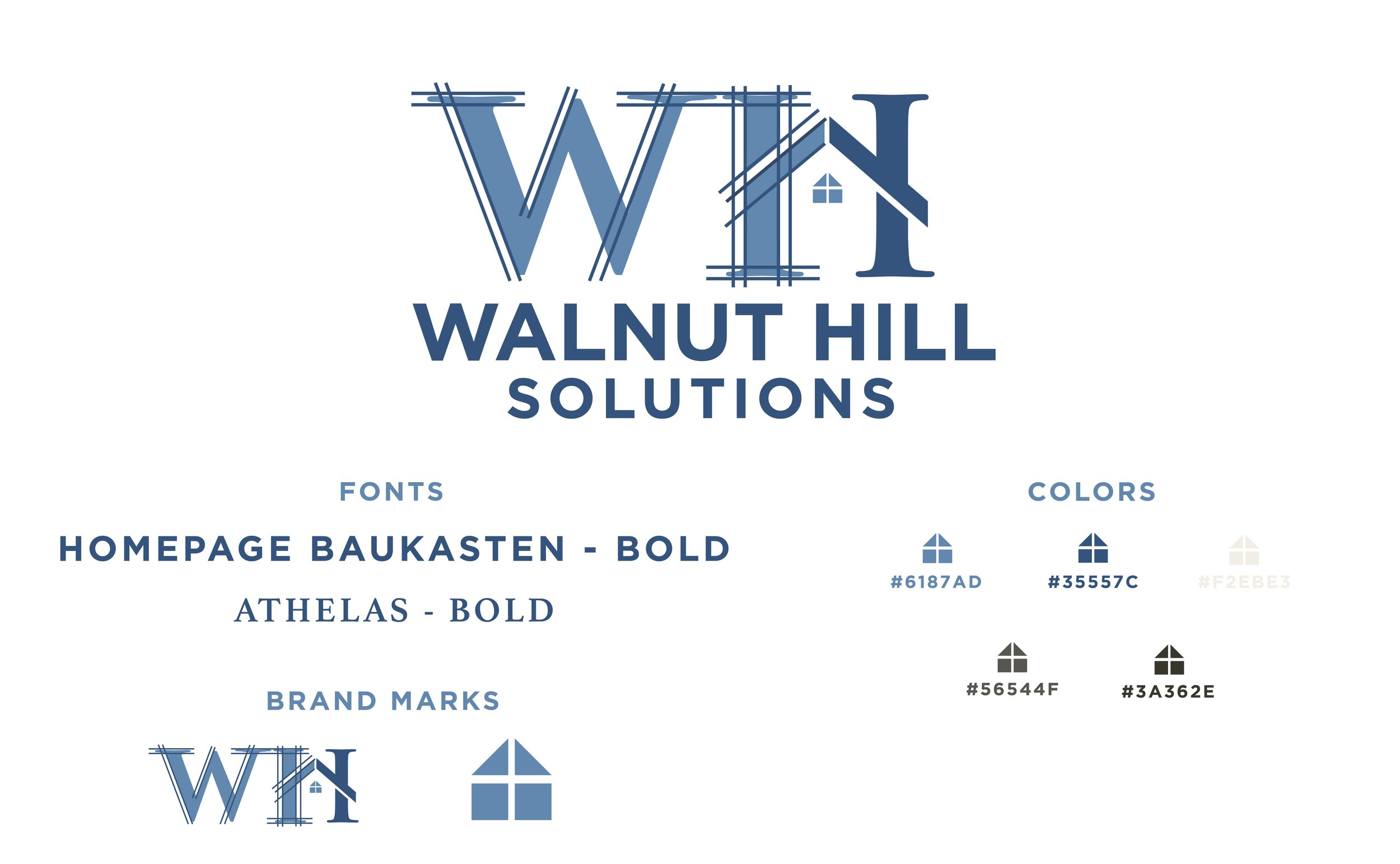
Walnut Hill is a new business, like many, that started with a stock logo. They wanted to elevate it and make it their own without investing into a full branding package.
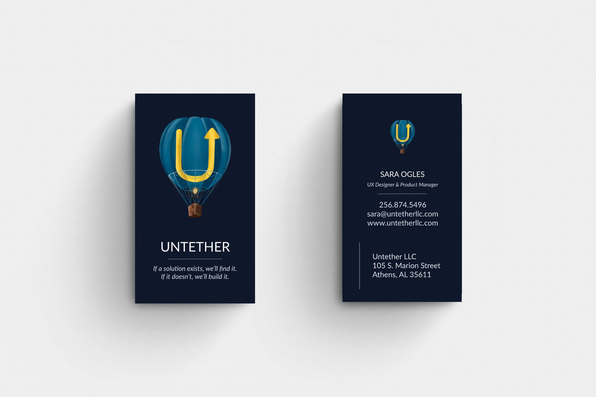
Untether wanted to update their 10 year old logo to be a little more timeless while still maintaining the foundation of the original brand. This logo was hand-drawn in Procreate, new fonts were chosen and the old color palette was revitalized in softer tones.
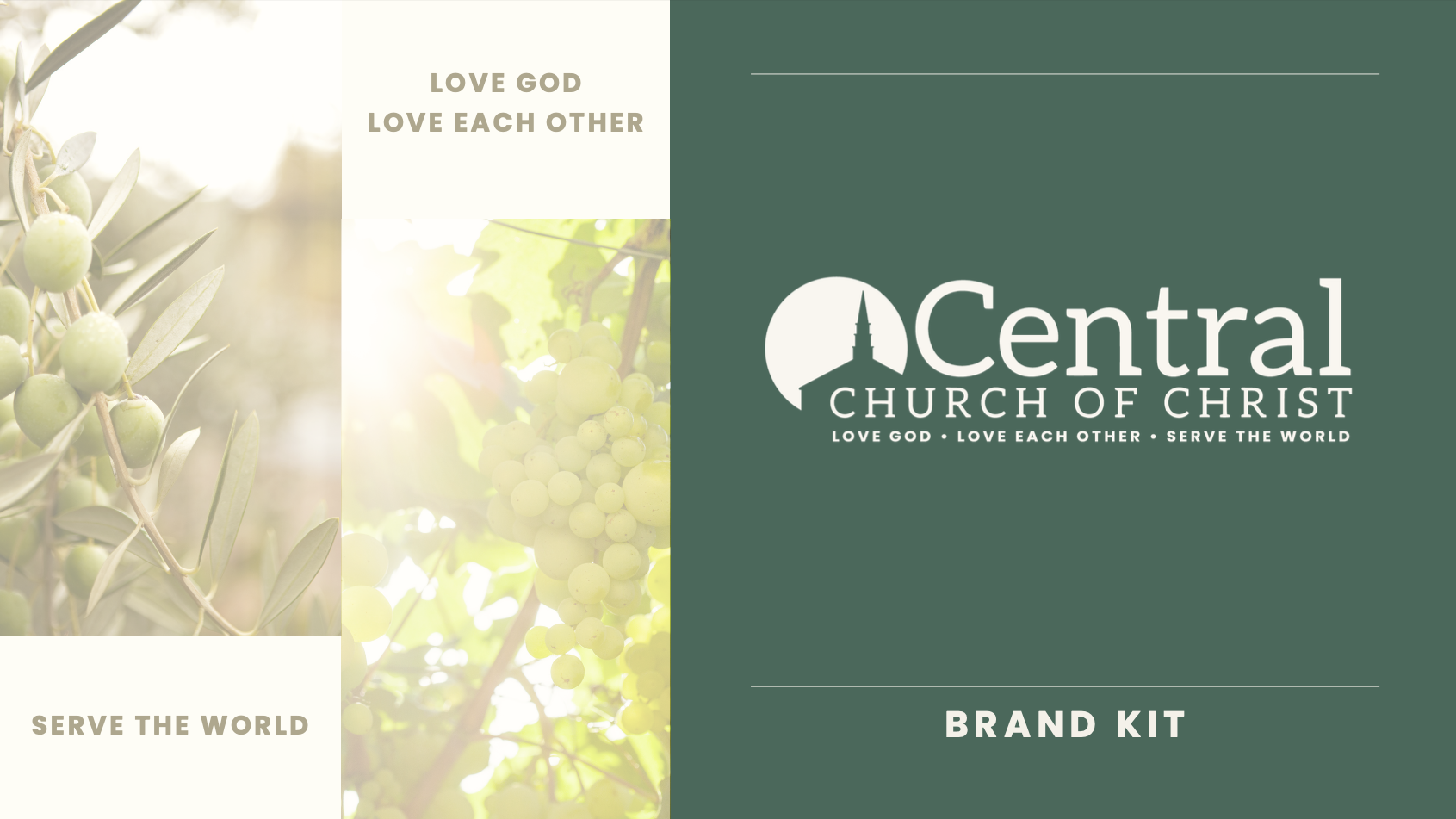
Central wanted to make sure their rebrand included the long-held church values. From the color psychology to showcasing their steeple, a unique landmark in town, they wanted to visually communicate peace, growth and stability.

For my own store branding, I wanted to play on my art signature since my brand is a pun of my initials. I also included an illustrated floral frame to bring cohesion between my business cards, sidewalk sign and packaging.